


Have you ever tried recalling any celebrated brand without imagining its logo or colour scheme? Sounds tough, isn’t it?! Well, humans are known to relate brands (even personalities) with certain qualities, colours, or powers and call them their identity. For example, half-bitten apple with iPhones, red & black stripes with Coca-Cola, four rings with Audi, and double G with Gucci!
In today’s digital competitiveness, a new buzzword, “corporate identity,” is getting all the heat for being an up-and-coming official on-brand hullabaloo. One fact: it is legit! Second fact: it is not slightly but entirely different from the brand identity.
This is the trick to maintaining your brand’s consistency and content effectiveness while strengthening your online footprint and giving your company an irreplaceable face and a memorable personality as long as it is thriving.
What Is Corporate Identity Design?
Focusing on the statement that brand identity differs from corporate identity, you must know the following:
- Brand identity is a term used to explain how consumers distinguish your brand’s presentation.
- Corporate identity summarizes how your company successfully showcases itself in the market through visual elements by understanding customer psychology.
Corporate identity designs must be evocative of your brand products, services, and values. Primarily, it includes logos, typeface, tagline and brand guidelines, fonts, imagery, colours, templated designs, tone of voice, and more. All elements are meticulously combined to craft an identity that is accepted and remembered globally. In physical form, the identifying factors can be packaging design, uniform graphics, signage, and flyers.
Why Is Corporate Identity Design Important?
- With a distinctive color scheme and taglines of your logo, you can better control or display your brand’s narrative.
- This design can be your solution to communicate the foundation, values, and culture of the company, along with showing people how the company works.
- There is no better way than corporate identity design to give your loyal customers and diligent employees a sense of trust, loyalty, and professionalism.
- A strong identity design can result in brand equity, luring stakeholders and investors.
- The best part of the consistent design is its ability to differentiate you from your competitors by creating brand awareness.
- At the same time, it reflects how creatively the company projects itself in its industry to facilitate maximum engagement with visitors or/and investors.
- A strong identity is an answer to boosting employee satisfaction and declining turnover.
- If you invest time, effort, and resources in a personalized identity, you will exhibit your determination to stay on trend and successful plans to prosper. A massive competitive edge, indeed!
- It can give your brand a more credible, genuine, and specialized character among its target audience.
- Are you ready to launch a new product? The existing company’s identity can significantly influence the customer’s perception. In the case of an upright identity design, your product will be perceived positively as high quality as soon as they are given the message.
5 Elements of Corporate Identity Design
Yes, corporate identity stands on the pillars of your brand’s culture, ethics, and communications (internal and external). But the significance of a decent yet innovative and matchless design cannot be denied.
Here are the top 6 factors that need your attention when finalizing the design to show the world how unique your brand is!
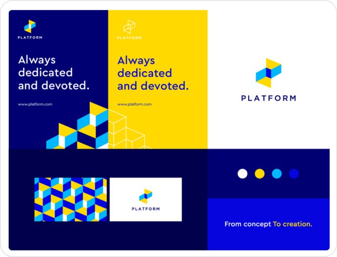
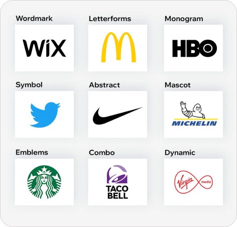
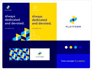
1. Logo Design
For Gen Z to understand: the logo is the main character. This is the foremost graphic aspect of corporate identity design that must never lack to stir emotions even at a glance. It should become an iconic symbol of what your company does. So, whenever someone takes your company’s name, the logo pops up instantly, letting them remember your services. Moreover, this visual signifier should contain all the features that perfectly align with the brand’s entire philosophy.
Always make sure to keep it adaptable and multifunctioning to be used for diverse marketing strategies and online platforms. Also, keep the minimalistic approach to maintain simplicity without compromising versatility. You better try adding a few moving/motion parts for an intriguing factor.
From picking a color palette that brilliantly expresses your brand’s individuality and relates to your marketplace to using appropriate words and language for your target audience – everything demands perfection for an interactive logo.
Tip: Before a final judgment, generate several mockups on free tools available online.
2. Colour Palette
The color scheme for the corporate identity design must be chosen considering which feelings you want to inspire and what vibes you intend to exude. Once selected, these official shades, tints, and tones will always be used in all brand assets, including logos and websites. You can pick one to two to several shades for bringing variability and aesthetic appeal. Else, choose one as a primary and several others as a secondary palette. Result? An effortlessly discernable look!
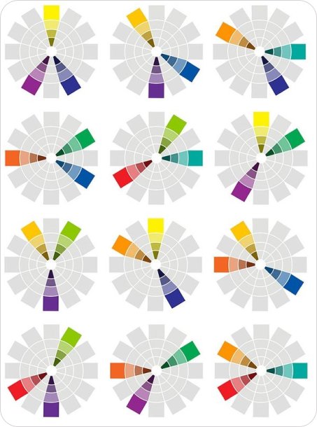
Are you wondering WHY colour holds so much importance? Because they are equally imperative culturally and emotionally. If your customer is a color observer, he/she will infer certain qualities from your choice. Let’s say;
- Your company will be perceived as trustworthy and thoughtful with blue shades.
- For green, it is all about peace, calmness, and health.
- Orange is for cheerful & friendly nature.
- With the red, you will radiate a sense of energy, power, and excitement.
- Yellow gives your brand the face of an optimistic and happy company.
Choosing white can show your company’s well-balanced and neutral stance.
A Striking Contrast
Moreover, brands can get creative with contrast to highlight important elements.
- A complementary contrast can be implemented to make the primary color perkier and more prominent.
- Also, brands are likely to pick “cold VS warm” colours. For example, blue, purple, and green VS orange, brown, yellow, and red.
- Talking about the mainstream practice of light-dark contrast, it is ideal for a dramatic touch.
Bonus: Single shade has the power to boost brand awareness by 80%.
3. Typography
Do you know the famous saying, “Imagery is not a past but present”? It is 100% true, BUT so is the typography for a strong corporate identity design. From writing style to size, shape to spacing, and placement to color – written words can leave a lasting impact. That’s why the words must be ideally readable and understandable while eliminating all language and cultural barriers. Also, it must be multipurpose to be used for different digital platforms.
Words are how we have always communicated to tell our stories! Before one can read the words, he can assume your brand to be authentic or fake, bold or elegant, formal or outdoorsy, luxurious or friendly from the typeface and fonts. It should be a mirror image of who the brand is. Summing up, the font used in your logo is a low-key identifying character to uphold credibility.

Where versatile and scalable typefaces must be the priority to satisfy specific markets, the tone of your message should be given importance equally. The fun fact is that all eminent brands have used a powerful combination of words to get their message ingrained in our minds alongside their logos. Everyone knows what “I’m loving it” or “Just do it” means!
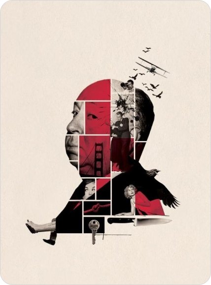
4. Imagery
One of the most far-reaching essentials of your corporate identity design? Images, photography, or illustrations representing the brand’s motives, vision, services or products, and values and transmitting emotional messages – all zeroed on the target audience.
Visuals are remembered for longer, easily recalled, and processed cognitively faster. To allow your customers to promptly recognize your business, choose a well-defined style of photos, artwork, graphics, and hand-drawn elements. Flawless and consistent photography not only sets you apart from your rivals but guarantees successful and extraordinary campaigns.
From a logo to a single icon image, all consumers need is ONLY a mere glimpse to deduce an immediate opinion. You need expert graphic designers, skilled web developers, creative photographers, and well-trained editors to create high-quality imagery that gives unrivaled uniqueness and allure.
Tip: The visual language contributes expressively to the awareness of the brand.
5. Icons
A simple and crisp yet explanatory icon can better facilitate communication being your superb brand ambassador. It helps envision processes or product properties. Besides, the icon is enough to make the brand recognizable. For example:
- Bird for Twitter
- Swoosh for Nike
- Four square figures for Microsoft
- Wordmark F for Facebook
- Iconic Cinderella Castle for Walt Disney, etc.
Each icon must align with other icons of your brand while giving references to the services themselves. In essence, creating iconographies is a synonym for bringing consistency.
Takeaway
Ready to create a corporate identity design? Start by defining a set of comprehensive style guidelines to guarantee a consistent implementation and successful outcome. From outlining how different visual assets will be placed to explaining why they must be part of the design – make a list to shun misunderstandings. After all, only a distinct corporate identity design will be remembered, clarifying your brand’s goals.

How to Create A Corporate Identity Design? | Tips & Design Inspirations
From presenting your brand’s personality through visual elements to making the corporate identity unique enough with intentionality and focus that you become distinguishable is paramount
Ultimate Guide to Corporate Identity Design | Importance & Elements of Design
Have you ever tried recalling any celebrated brand without imagining its logo or colour scheme? Sounds tough, isn’t it?! Well, humans are known to relate

Agency is a business you hire to outsource
The following Terms and Conditions govern the absolute use of the Kwiko’s website, content, products, and services available at or through the website (herein referred

